Project Overview
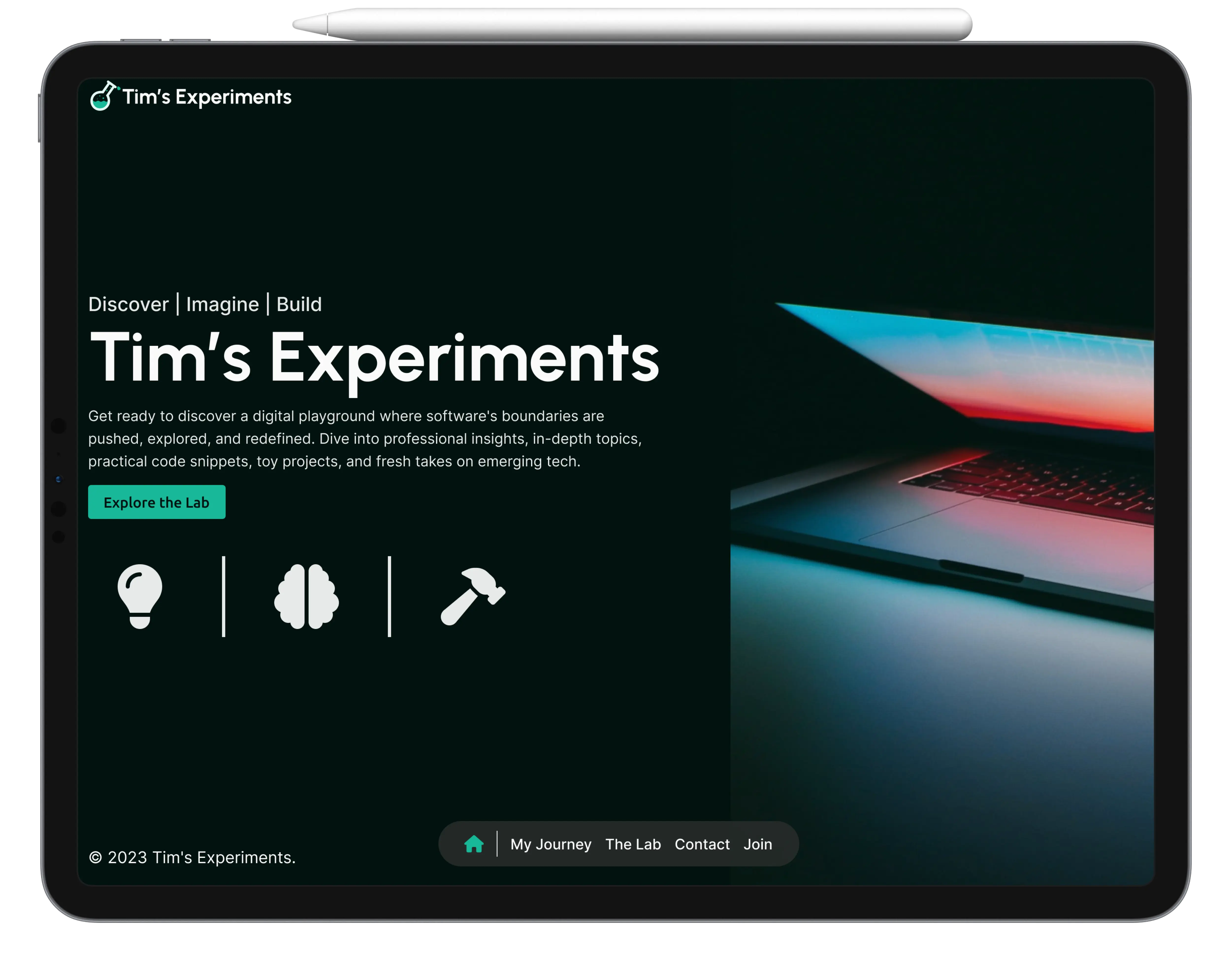
“Tim’s Experiments” represents a distinctive project by an independent tech enthusiast and blogger. This website stands as a dynamic platform, showcasing a deep passion for technology and software engineering. It serves as a hub for sharing insights, experiences, and knowledge in these fields.
Challenge
Designing the “Tim’s Experiments” website involved a nuanced challenge: merging the informal charm of a personal blog with the detailed technicality of software engineering articles, appealing to a wide audience from beginners to experts. The project also focused on achieving a simple yet modern UI, balancing a sleek, uncluttered look with advanced functionality. This approach aimed to create an inviting, easy-to-navigate online space that subtly blended minimalism with contemporary design, making it a standout in the tech blogging sphere.
Proposed Solution
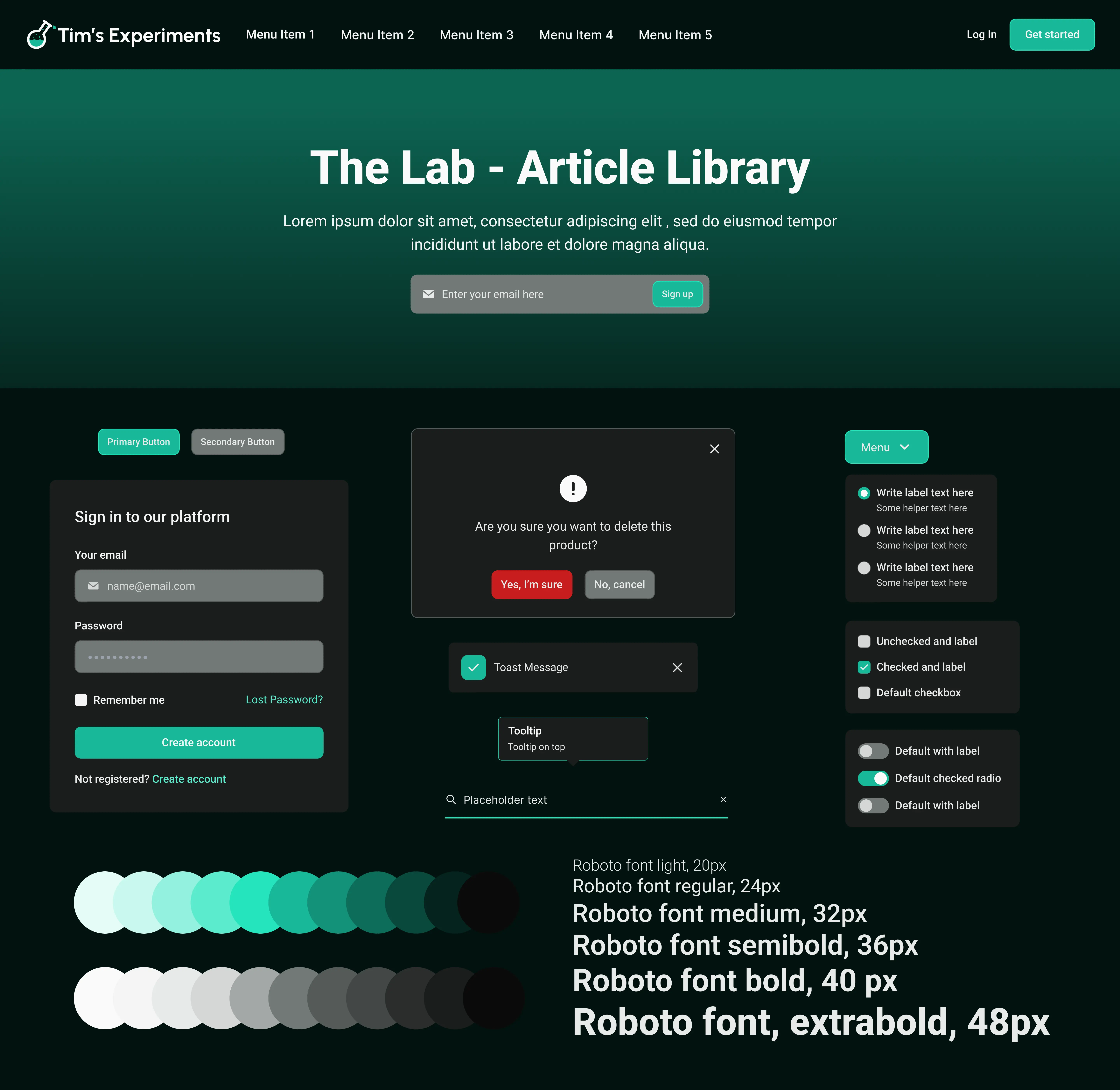
The website’s design was centered around a persona combining approachability with technical expertise, aimed at resonating with a diverse audience from casual readers to tech professionals. A key feature, “The Lab,” offers in-depth software engineering articles for advanced learning, aligning with the site’s user-focused ethos and maintaining an accessible, user-friendly interface.
Impact
My design work significantly enhanced the platform, allowing the tech enthusiast to effectively showcase their work, resulting in a 40% increase in website traffic and a 25% boost in user engagement. “The Lab” section, a major feature, deepened user involvement with a 30% rise in article shares and a 50% jump in newsletter subscriptions. Additionally, the design fostered networking & collaboration enriching the user experience and building a dynamic community around the site.
Let’s explore the insights
Comparative Competitive Audit
Recognizing the importance of context and competition, I conducted a thorough Competitive Audit. This involved studying similar business models and competitors to understand the market landscape. The goal was to identify trends, best practices, and gaps in the current market offerings, which could be leveraged to create a distinctive and competitive design. By analyzing how independent bloggers vs consulting firms showcase their sites, I gained insights into effective design elements, content strategies, and user engagement tactics. This comprehensive understanding allowed me to strategize a design that was not only user-centric but also stood out in the competitive field of tech blogging.
Moodboard Concepts & Selection
In the moodboarding phase, I used insights from the competitive audit to shape my visual direction, opting for a dark mode concept for its modern appeal and popularity in tech. The chosen style and color palette were designed to resonate with my target audience and stand out in the market. I also prioritized accessibility, ensuring the design was user-friendly for all. The final moodboards, refined with collaborative feedback, merged these insights into a cohesive visual language, highlighting my commitment to blending market research, user preferences, and accessibility in my design approach.
Enhancing Engagement
In elevating the website’s design, I introduced a specialized section called “The Lab,” where users can explore articles on various software engineering topics. This addition was a direct response to the competitive audit and moodboard insights, aiming to offer unique value and engage a more technically inclined audience. “The Lab” serves as a knowledge hub, aligning with the dark mode aesthetic and user-centric design principles established in the moodboarding phase.
Furthermore, I integrated a complimentary membership service, “Become Part of the Discovery,” to deepen user engagement. This feature, inspired by trends and gaps identified in the competitive analysis, allows users to immerse themselves more fully in the content and community. It reflects a strategic blend of the insights from the competitive audit and the visual direction set by the moodboards, enhancing the website’s appeal and functionality while maintaining accessibility and user-friendliness.
Explore the website’s full scope with my interactive prototype and witness the user-centric design & functionality firsthand 👇
My impact impact
In my role as Product Designer for “Tim’s Experiments,” I played a crucial role in elevating the website into a more intuitive and engaging platform. My journey began with an in-depth competitive analysis, which informed the creation of moodboards that set the stage for a visually appealing and accessible design.
A key achievement was the introduction of “The Lab,” a section dedicated to in-depth software engineering content, thoughtfully crafted to appeal to both casual browsers and tech enthusiasts. Additionally, the integration of the ‘Become Part of the Discovery’ membership service significantly boosted user engagement, creating a sense of community and ongoing interaction. My commitment to user-centric design principles throughout the project not only enhanced the overall user experience but also solidified “Tim’s Experiments” as a distinctive and valuable resource in the tech blogging and educational landscape.